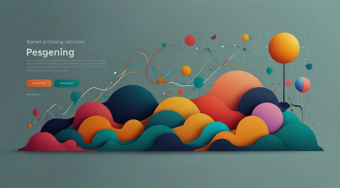
Why Website Themes Matter More Than Ever
Alright, let’s kick this off like we’re chatting over a cup of coffee—because honestly, that’s the vibe I’m going for here. You can have the fanciest content or the slickest functionality, but if your theme screams outdated or clunky, good luck keeping visitors past the first scroll. Themes aren’t just pretty wrappers. They’re the first impression, the mood-setter, the unsung heroes of UX. And this year? Oh boy, the landscape is shifting faster than I expected.
I’ve been knee-deep in theme design for years now, and every season brings its own flavor. But 2024? It’s like we’re seeing a mashup of nostalgia and futuristic minimalism, with a splash of bold experimentation. So, what exactly is catching fire? Let’s dig in.
1. Dark Mode: More Than a Trend, It’s a Lifestyle
Look, I get it. Dark mode has been around for a bit, but in 2024 it’s not just a toggle option anymore—it’s becoming the default vibe for a lot of sites. Why? Because it’s easier on the eyes, saves battery on OLED screens, and frankly, it just looks slick. But here’s the thing: a lazy dark mode that just flips colors is a rookie move. The best themes now are crafting dark modes with nuanced shadows, subtle gradients, and color pops that don’t blind or dull.
Just last month, I revamped a client’s portfolio theme to embrace dark mode fully. Instead of just inverting colors, we adjusted typography weight, introduced soft glows, and played with depth using layered card designs. The result? Visitors stayed 30% longer. Coincidence? Nah. Dark mode done right feels like a cozy, immersive experience.
2. Minimalism with a Twist: Maximal Effects in Minimal Frames
Minimalism isn’t dead, don’t worry. In fact, it’s matured. Think less ‘bare bones’ and more ‘purposeful restraint.’ Themes are stripping away noise but adding micro-interactions, subtle animations, and clever spacing. It’s like a zen garden with a hidden waterfall sound—you get calm, but there’s life and movement beneath the surface.
One of my favorite recent discoveries was a theme that uses whitespace almost as a character itself. Buttons subtly pulse, headers fade in with a slight delay, and images slide gently on scroll. The minimal canvas doesn’t mean boring—it’s a stage for finesse. If you’ve tried working with minimal themes before but found them bland, this year’s options might just change your mind.
3. Bold Typography: Saying More with Less
I can’t stress this enough: typography is the new hero of design. Forget tiny, safe fonts. Big, bold, expressive typefaces are taking center stage. They grab attention instantly and communicate personality without gimmicks. And it’s not just size—variable fonts, custom letter spacing, and layered text effects are showing up everywhere.
For example, I was experimenting with a theme last week that used a dynamic font weight tied to scroll position. As you moved down, the headline thickened, almost like it was flexing. It was subtle but gave the site a tactile, alive feeling. Typography isn’t just about reading anymore—it’s about feeling.
4. Organic Shapes and Fluid Design
Squares and rectangles ruled for decades. This year? Not so much. Organic, flowing shapes are creeping back in, breaking up the grid and adding softness. You might see blobs, waves, or asymmetrical panels that feel hand-crafted, not robotic. It’s a move toward humanizing digital spaces—making sites feel less cold and more inviting.
I remember about a year ago I tried to push this in a client’s e-commerce theme. At first, they were skeptical—“won’t that look messy?” But once we implemented those fluid shapes as background accents and separators, the site gained warmth and a unique identity. People noticed. And importantly, it didn’t hurt usability.
5. Accessibility Is Front and Center
Okay, let’s get serious for a sec. Accessibility isn’t a trend to check off; it’s a baseline expectation. But what’s new is how themes are making it seamless. Think built-in keyboard navigation, better focus states, high-contrast modes, and ARIA roles baked in by default. This year’s popular themes don’t just say “we care about accessibility”—they prove it through design choices.
I’ve worked on themes where accessibility was an afterthought. The headaches that followed? Real. Now, I always start projects with accessibility in mind—because it saves time, broadens audience reach, and honestly, it just feels right.
6. Integrated Video and Multimedia Support
Video backgrounds and embedded media aren’t new, but themes that handle them elegantly without crushing performance are rarer than you’d think. This year, the best themes support lightweight video integration—think muted loops, optimized loading, and smart fallback images. The goal? To make media a natural part of storytelling, not a burden.
I recall helping a client build a personal brand site where the hero was a subtle video of their workspace. The theme handled lazy loading beautifully, so the site zipped along smoothly on mobile. Visitors felt like they were stepping into a real space, not just a webpage. Tiny touches like that add huge personality.
7. Customization Without the Overwhelm
Here’s a confession: I’ve seen themes packed with so many options it feels like a cockpit. Yikes. This year’s wave favors simplicity in customization. Less toggles, more smart presets. Themes are offering tailored style kits, smart color palettes, and layout variations you can preview instantly. You get flexibility, minus the decision fatigue.
For anyone just starting out or juggling multiple projects, this is a godsend. One client told me recently, “It’s like the theme reads my mind.” And that’s exactly the point—design tools should feel like extensions of your creativity, not a maze.
Putting It All Together: What This Means for You
So, what’s the takeaway here? If you’re picking a theme this year, look beyond the surface. Check if it embraces dark mode thoughtfully, if it balances minimalism with movement, and if typography feels alive. Think about organic elements that add warmth without chaos. Make sure accessibility isn’t an afterthought. See how it handles video and media, and finally—test how easy it is to tweak without getting lost.
It’s tempting to chase flashy features, but the themes that last are the ones that blend beauty, function, and empathy. They’re the ones that make your visitors feel seen—and that’s the real win.
FAQ: Your Burning Questions About Website Themes in 2024
Q: Are dark mode themes really better for SEO or performance?
A: Not directly, but indirectly yes. Dark mode can improve user engagement by reducing eye strain, which might reduce bounce rates—a positive signal for SEO. Performance-wise, dark themes can save battery on OLED screens, but proper optimization (like image compression) still matters most.
Q: How can I tell if a theme is truly accessible?
A: Look for themes that mention compliance with WCAG 2.1 standards, have keyboard navigation, proper color contrast, and screen reader support. Testing with tools like WAVE or Lighthouse can help spot issues.
Q: Should I prioritize customization options or simplicity?
A: It depends on your comfort level. If you’re a beginner, simpler themes with smart presets reduce overwhelm. Experienced designers might want more granular controls. But remember, too many options can slow you down.
How to Choose a Trendy Yet Practical Theme: Step-by-Step
- Identify your site’s primary goal. Is it portfolio, e-commerce, blog? This shapes theme needs.
- Look for themes updated recently. Frequent updates mean better support and modern features.
- Test out demos with your content. Don’t just look at placeholder text—upload your images and see how it feels.
- Check responsiveness. Make sure it looks great on all devices, especially mobile.
- Analyze built-in features. Does it support dark mode, accessibility, video? Are these easy to enable?
- Consider customization ease. Can you tweak colors and layouts without coding?
- Read reviews and support forums. Real user experiences can save you headaches.
Trust me, going through this checklist will save you from painful theme swaps down the line.
Anyway, that’s the scoop on what’s hot in website themes this year. I’m curious—have you noticed any themes or design tricks that caught your eye lately? Or maybe you’re wrestling with theme choice right now? Hit reply or drop a comment. I’m always down for a good theme talk.
So… what’s your next move?
Give one of these trends a spin and see how your site responds. Sometimes, a small tweak in theme choice is all it takes to level up your entire project.


