Why Immersive Theme Design Matters More Than Ever
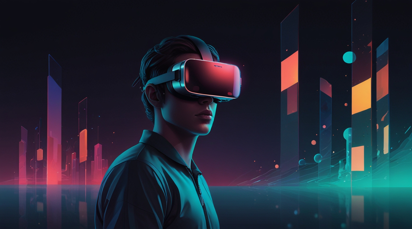
Alright, picture this: You’re slipping on a VR headset or pulling out your phone for an AR experience. The world around you shifts—suddenly, pixels and polygons aren’t just flat images anymore; they’re living, breathing spaces you can wander through, touch, and even feel. As someone who’s spent way too many late nights tweaking WordPress themes for clean, engaging user experiences, diving into immersive theme design for AR and VR feels like stepping into a whole new dimension—literally.
But here’s the kicker: designing for these platforms isn’t just about making things look cool or flashy. It’s about crafting environments that feel natural and intuitive, that guide users without overwhelming them, and that respect the unique ways we perceive virtual spaces. This is a playground where traditional UI rules don’t just bend—they often break.
So, what’s really cooking in immersive theme design right now? Let’s unpack the trends that are shaping how interfaces in AR and VR are evolving, and how you can start thinking about them in your own projects.
The Rise of Spatial Design: Beyond Flat Screens
Remember the first time you tried a VR headset and noticed how everything is around you, not just in front of you? That spatial awareness is a game-changer. Immersive theme design is increasingly embracing spatial interfaces—meaning your UI elements aren’t fixed to a 2D plane but exist in three-dimensional space.
This shift demands a fresh mindset. Instead of pixels and grids, you’re dealing with depth, distance, and user movement. For example, buttons might float near your hand, menus could arc around your field of vision, or information panels might subtly shift as you look away and back.
From a practical standpoint, this means designing themes that consider ergonomics and natural interactions. Ever noticed how reaching too far or looking too sharply up or down in VR gets tiring? Good immersive themes optimize placement for comfort, reducing user fatigue and keeping engagement high.
On a recent project, I experimented with a VR gallery theme where navigation buttons gently hovered at shoulder height and faded out when not in use. The feedback was surprisingly positive—users said the experience felt “effortless,” which is exactly the vibe you want.
Minimalism with Purpose: Less Is Definitely More
It’s tempting to cram immersive themes with dazzling effects—floating holograms, animated particles, you name it. But here’s the lesson learned the hard way: clutter kills immersion. When your senses are overloaded, the magic breaks.
Minimalism in immersive design isn’t just about aesthetics; it’s about focus. Designers are paring back to essentials, using whitespace (or empty space) as a powerful tool to let users breathe and absorb. Think of it as the digital equivalent of a quiet room amid a noisy city.
Color palettes are getting smarter too—soft gradients, muted tones, and subtle contrasts help keep the eyes from tiring. The key is to highlight interactive elements without shouting at you. This subtle guidance feels natural instead of forced.
If you’re coming from traditional web design, this might feel like a step backward. But trust me—when the interface fades into the background, the experience shines.
Context-Aware Themes: Smarter Interfaces That Adapt
Another exciting trend is context-awareness. Immersive themes are starting to respond dynamically to the user’s environment and behavior. For example, an AR shopping app might adjust lighting and shadows on virtual products based on the room’s actual lighting, making the experience way more believable.
On the VR side, themes can detect where the user is looking or how they move, adjusting menus and prompts accordingly. It’s like having an interface that anticipates your needs, not just reacts to clicks.
This requires a blend of design and smart programming—something I’ve been tinkering with using Unity and React 360. It’s a bit of a learning curve, but seeing your theme adapt smoothly to real-time user inputs? That’s magic, plain and simple.
Haptic and Audio Integration: Designing for All Senses
Immersive interfaces aren’t just visual anymore. Designers are weaving in audio cues and haptic feedback to deepen engagement. Imagine a VR theme where buttons subtly vibrate or emit a soft click when pressed, or where ambient sounds shift as you move through different virtual zones.
This multi-sensory approach is powerful because it mimics real-life interactions. It’s like when you pick up a coffee cup—there’s weight, warmth, a slight sound as it touches the table. Replicating this digitally helps bridge the gap between the virtual and the physical.
For theme designers, this means collaborating closely with developers and sound artists. In my experience, even simple additions—like a well-timed audio cue—can transform a theme from “nice” to “immersive.”
Accessibility in Immersive Design: A Growing Priority
Here’s a topic that’s often overlooked but absolutely crucial: accessibility. Designing AR and VR interfaces that everyone can use isn’t just good practice—it’s a necessity as these platforms grow.
Things like adjustable text sizes, high-contrast modes, and alternative input methods are becoming standard considerations. Plus, designers are starting to think about motion sensitivity—because VR can cause discomfort for some, and themes need to minimize that risk.
This is an area where I see a lot of room to grow. I’ve been experimenting with customizable UI scales and alternative navigation schemes to accommodate different users. It’s challenging but rewarding; accessibility unlocks immersive experiences for a wider audience, which is the whole point, right?
Bringing It All Together: Practical Tips for Theme Designers
So, if you’re itching to dip your toes into immersive theme design, here are a few pointers from the trenches:
- Start with user comfort. Always test your themes for ergonomics—easy reach, natural gestures, and minimal strain.
- Prioritize simplicity. Resist the urge to overdecorate. Clean, purposeful designs win every time.
- Think spatially. Sketch your interfaces in 3D space, not just on paper or screens.
- Leverage context. Use sensors and data to make your themes responsive and adaptive.
- Don’t forget accessibility. Build options for different needs from the ground up.
- Experiment with sensory cues. Add subtle audio and haptic feedback to enrich interactions.
And honestly? Don’t rush it. Immersive design is a new frontier, and it’s okay to stumble, iterate, and learn as you go. Remember the first shaky days of responsive web design? We’ll get there with AR and VR too.
Final Thoughts: The Future Is Hands-On (and In Your Face)
Immersive theme design isn’t just a fad—it’s a fundamental shift in how we interact with digital content. For theme designers like us, it’s like learning a new language, one that’s spoken in gestures, space, and sensation.
It’s thrilling and a bit intimidating, but if you lean into it with curiosity and patience, the rewards are enormous. Plus, seeing users get genuinely lost in a world you helped create? There’s nothing quite like it.
So… what’s your next move? Maybe try sketching a spatial menu, or tinker with haptic APIs. Or just throw on a headset and get inspired by what’s already out there. Whatever it is, keep it hands-on and keep it honest.
Give it a try and see what happens.


