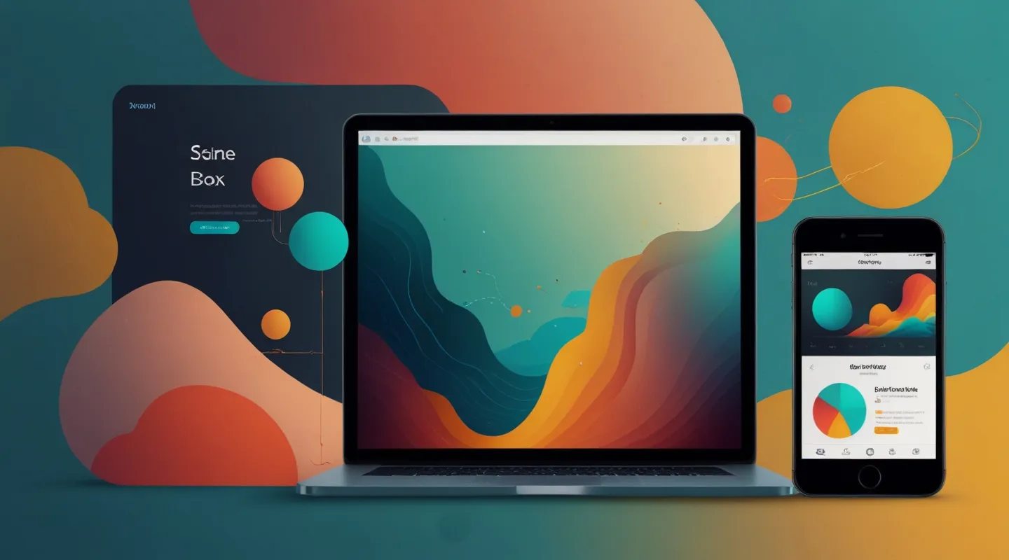
Why Responsive Themes Aren’t Just a Nice-to-Have Anymore
Remember the days when building a website meant perfecting it for the desktop experience and calling it a day? Yeah, me too. But if you’re still thinking that way, you’re basically handing your users a wonky experience on phones and tablets. I can’t stress enough how vital responsive themes have become. It’s not just about looking pretty—it’s about survival.
Think about it: over half of web traffic now comes from mobile devices. And honestly, if your site feels like a clunky puzzle on someone’s phone screen, you’ve lost them before they even scroll. Responsive themes are your best friend here—they adapt, flex, and shape-shift your content to whatever screen your visitor’s using. No pinching, no sideways scrolling, no squinting to read text. Just smooth sailing.
My Personal Wake-Up Call: The Tablet Test
Early in my career, I once slapped together a theme that looked stellar on desktop but was a mess on tablets. I didn’t test thoroughly because—well, who really browsed on tablets back then? Turns out, a client’s target demographic was mostly tablet users, and their feedback was brutal. Buttons were too small, images cut off, nav menus exploded into chaos. It was a hard lesson but a priceless one.
From that moment on, I made it a rule: test on every device. Not just the popular ones either—odd screen sizes, older models, weird browser quirks. Because guess what? Your users aren’t all uniform. Some are on a shiny new iPhone, some on a decade-old Android. Your theme needs to meet them wherever they are.
What Makes a Theme Truly Responsive?
It’s more than just resizing elements. Here’s what I look for (and build) every time:
- Fluid grids: Forget fixed pixels. Use percentages or relative units like rems and ems to let layouts breathe.
- Flexible images: Images should scale or crop gracefully without breaking layout or losing context.
- Media queries: The classic CSS hero—customizing styles based on screen width, resolution, or orientation.
- Touch-friendly UI: Bigger buttons, enough spacing, gestures considered. No one wants to tap a link and miss.
- Performance optimization: Responsive isn’t just look and feel. It’s speed too. Mobile devices are often on slower connections, so themes must load efficiently.
And beyond that, accessibility plays a role. Responsive design should also accommodate different users’ needs—not just device sizes.
Tools & Tips I Swear By When Crafting Responsive Themes
Over the years, I’ve tested and tweaked countless strategies. Here’s a handful of practical tools and habits that help me sleep better at night:
- Browser DevTools Device Mode: Chrome and Firefox both have excellent device emulation modes. But don’t stop there—real devices are key.
- Responsive design frameworks: Bootstrap, Foundation, or even lighter alternatives like Tailwind CSS can jumpstart your layouts. But remember, they’re just tools; customize to your needs.
- Image optimization services: Tools like ImageOptim, Squoosh, or cloud-based solutions like Cloudinary help deliver crisp images without the bloat.
- Automated testing: Services like BrowserStack or LambdaTest let you see how your theme behaves across dozens of devices and browsers.
- Mobile-first design: Start designing for the smallest screen and scale up. It’s harder but keeps your focus razor-sharp.
Walking Through a Real-World Example: The Navigation Menu Challenge
Navigation is a classic trouble spot. On desktop, you’ve got space to spread out links horizontally. But on mobile? That same menu can gobble up precious screen real estate or become unusable.
So, here’s what I do: I design a collapsible hamburger menu for smaller devices, but with a twist. Instead of just hiding links, I prioritize the top 3–5 based on user behavior analytics and push the rest deeper. The menu still loads fully but keeps the interface uncluttered.
And here’s a trick I learned from some clever colleagues—animated transitions when toggling the menu add a subtle polish and cue users visually. It’s a tiny detail but makes a huge difference in perceived quality.
Common Pitfalls to Dodge
Not everything responsive is created equal. Watch out for these traps:
- Ignoring landscape vs. portrait modes: Your site might look fine vertically but break sideways.
- Loading the same huge images for all devices: No bueno. Use srcset or picture elements to serve device-appropriate images.
- Overcomplicating with too many breakpoints: More isn’t always better. Aim for meaningful, manageable ones.
- Forgetting about performance: A responsive site that’s slow is still a bad experience.
Wrapping Up: Why Responsive Themes Are More Than Just Technical Jargon
At the end of the day, responsive themes are about empathy. They’re about meeting your users where they are and respecting their time and device choices. It’s a craft, sure, but also a mindset.
If you’re just starting out, don’t sweat trying to nail everything perfectly right away. Start simple, test often, and iterate. And if you’ve been around the block, maybe this is your nudge to double down on responsiveness—because your users deserve that smooth, seamless experience.
So… what’s your next move? Try pulling up your current project on your phone right now. How’s it look? If it’s anything less than flawless, you’ve got some fun work ahead. But hey, that’s the kind of challenge I live for.


