Why Adaptive Themes Matter in Mixed Reality Browsing
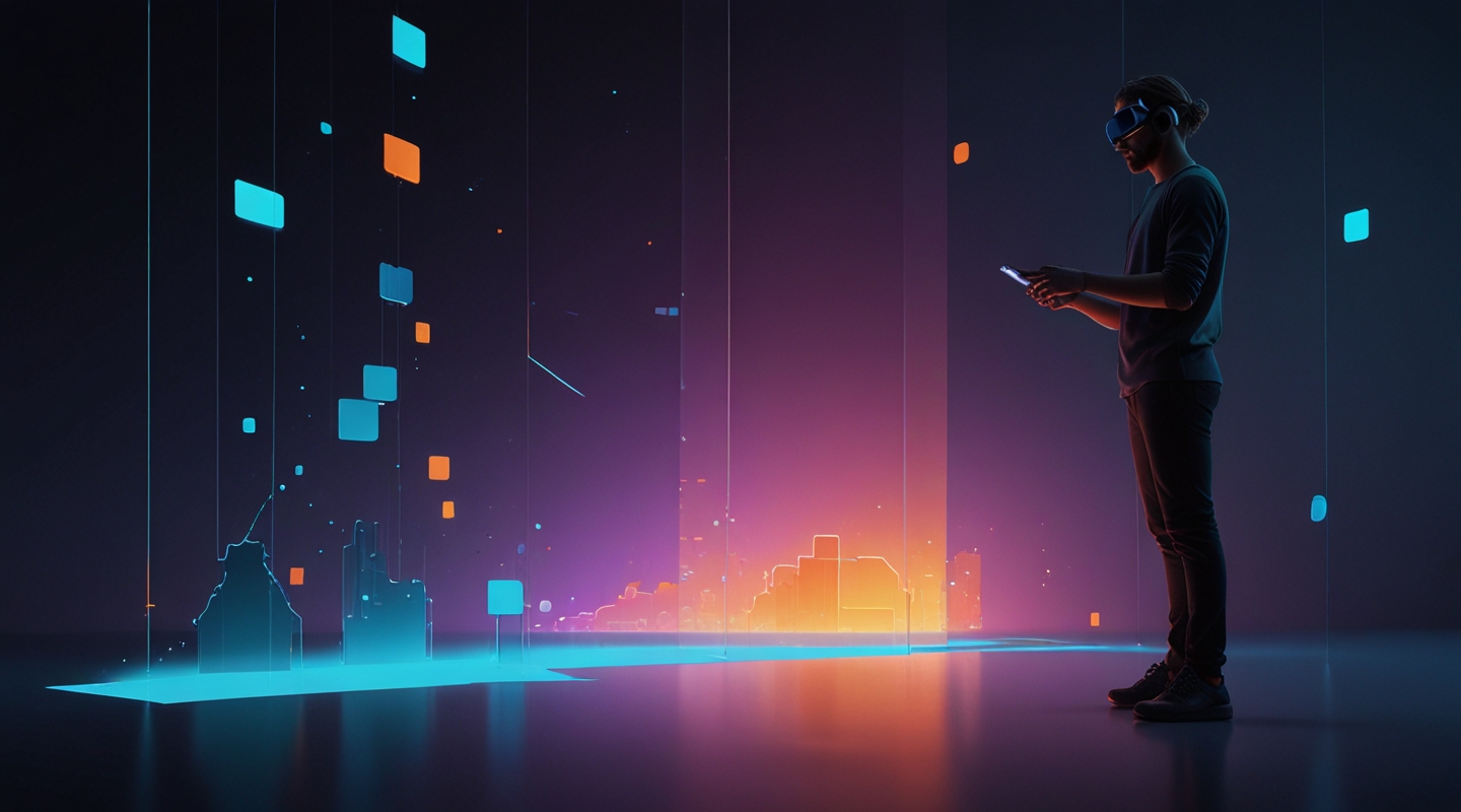
Alright, let me paint you a picture. Imagine you’re not just clicking through a website on your laptop or phone anymore—you’re stepping inside it. Mixed Reality (MR) isn’t some far-off sci-fi fantasy; it’s barreling toward us faster than most designers realize. And if you’re like me, who’s spent countless hours tweaking WordPress themes to perfection, you know that what works on a flat screen often falls flat when you’re literally surrounded by your content.
Adaptive themes are the unsung heroes here. They’re like the Swiss Army knives of design, flexing, shifting, and molding themselves to whatever environment the user happens to be in. But here’s the kicker: mixed reality browsing isn’t just about screen size or resolution anymore. It’s about spatial context, depth, lighting, and interaction models. Themes need to be alive, responsive not just to window sizes but to how users move, look, and even think in these new digital realms.
The Real Challenge: Designing for an Immersive Canvas
Back in the day, responsive design was cutting-edge—making sure your site looked good on a phone, tablet, or desktop. But MR throws a curveball: the canvas stretches beyond a rectangle. You’re working with 3D space, where elements can float, snap, or fade based on where a user’s gaze lands or how they gesture.
I remember experimenting with a prototype MR theme last year. The first version was a disaster. Text blocks that looked crisp on flat screens became awkward, hovering blobs that strained the eyes in 3D. Navigation menus felt like clunky afterthoughts. It was obvious—adaptive meant more than resizing; it meant rethinking hierarchy and layout entirely.
So, what’s the takeaway? You have to design themes that anticipate spatial behavior. For example, placing key navigation elements in the user’s natural line of sight, or using subtle depth cues to guide attention without overwhelming. That’s a balancing act—too much depth and your users get motion sickness; too little and it’s just a flat webpage floating in space.
Key Principles for Adaptive Mixed Reality Themes
Let me break down some practical principles I swear by, distilled from hands-on tinkering and a fair share of head-scratching moments.
- Context Awareness: Your theme should detect the device’s environment and adjust accordingly. This means tailoring font sizes, contrasts, and layout orientation based on whether the user is in AR glasses, a VR headset, or a hybrid setup.
- Spatial Hierarchy: Unlike flat design, where vertical scrolling dominates, MR lets you arrange content in 3D layers. Use depth to establish priority—important info up front, secondary details subtly behind or to the side.
- Gesture-Friendly Navigation: Traditional clicks don’t cut it. Themes need to support gestures or gaze-based controls naturally. That’s where designing for “hover” states or timed selections comes in.
- Light and Shadow Play: Lighting isn’t just for aesthetics. In MR, it helps ground virtual elements in reality. Adaptive themes should respond to ambient light or user focus, adjusting shadows and highlights to maintain comfort and clarity.
- Performance Optimization: MR devices slog under heavy graphics. Themes have to be lean—minimize resource-heavy animations or scripts that could kill framerates or battery life.
From Theory to Practice: Crafting an Adaptive MR Theme
Okay, enough theory. Here’s how I’d approach building an adaptive MR theme step-by-step, in a way that hopefully feels like a chat, not a manual.
- Start with a Minimal Base: I usually pick a lightweight theme foundation—think something clean with minimal CSS bloat. In MR, simpler is better because you want to layer your spatial design on top without fighting legacy styles.
- Map Out User Interaction Zones: Sketch where users’ eyes and hands naturally rest in mixed reality. Research from XR UX studies can help here. For instance, placing navigation elements in the lower center of the visual field reduces fatigue.
- Use CSS Variables & Media Queries Creatively: Beyond just width and height, target MR-specific conditions like user proximity or device orientation. CSS media queries are evolving, and you can start experimenting with new features like the
environment-blendingorforced-colorsqueries. - Implement Layered Content: Use CSS 3D transforms and WebXR APIs to position elements in space. This takes some JavaScript finesse to sync with the user’s headset position and gaze direction.
- Test on Real Hardware: Emulators are fine for early stages, but nothing beats the gut check of strapping on an actual MR headset and walking through your theme. I like to move around physically, squinting at text, reaching for buttons, and noting what feels natural or janky.
- Iterate Based on Feedback: MR is still experimental for many users. Collect feedback from diverse testers—because what feels intuitive to a gamer might frustrate a casual browser.
Tools and Resources That Make Life Easier
I won’t pretend you can do this all by hand. Thankfully, some tools have popped up that make adaptive MR theming less of a nightmare.
- Three.js — A JavaScript library that helps you build 3D experiences on the web. It’s indispensable for positioning and animating elements in MR spaces.
- WebXR API — The browser’s gateway to mixed reality hardware. Mastering this allows your theme to respond dynamically to MR device inputs.
- Advanced CSS Media Queries — Dive into emerging features that go beyond screen size, like light-level queries or hover detection, to craft truly adaptive styles.
And hey, don’t forget the basics: good typography, accessible color contrast, and performance-first mindset still reign supreme. MR might be new, but users still need legible, fast, and usable interfaces.
Common Pitfalls (and How to Dodge Them)
If you’re like me, you’ll hit some classic stumbling blocks. Here’s a quick rundown of what to watch out for:
- Overcomplicating Interactions: Just because you can add fancy 3D effects doesn’t mean you should. Sometimes a simple floating panel that fades in and out beats a spinning cube menu any day.
- Ignoring Accessibility: MR is an accessibility frontier. Voice commands, adjustable font sizes, and alternative navigation modes aren’t optional—they’re necessary.
- Poor Performance: Lag in MR isn’t just annoying; it can cause nausea. Keep your code tight and test early.
- Assuming One Size Fits All: Different MR devices have wildly different specs and input methods. Design your themes to be modular and adaptable.
Looking Forward: The Future of Themes in Mixed Reality
I’m genuinely excited about where this goes. Themes won’t just be about static color palettes or typography anymore—they’ll be about crafting immersive atmospheres that feel alive. Imagine themes that shift colors based on your mood, or layouts that rearrange themselves intuitively as you move through a virtual room.
It’s a wild world, but as WordPress designers, we have a unique chance to shape how the web evolves in this space. If you’ve been feeling stuck in the same old 2D box, mixed reality is the fresh playground you’ve been waiting for.
Anyway, enough from me. Have you toyed with MR themes or adaptive browsing experiences? What weird quirks or breakthroughs have you seen? I’m all ears.
So… what’s your next move?


