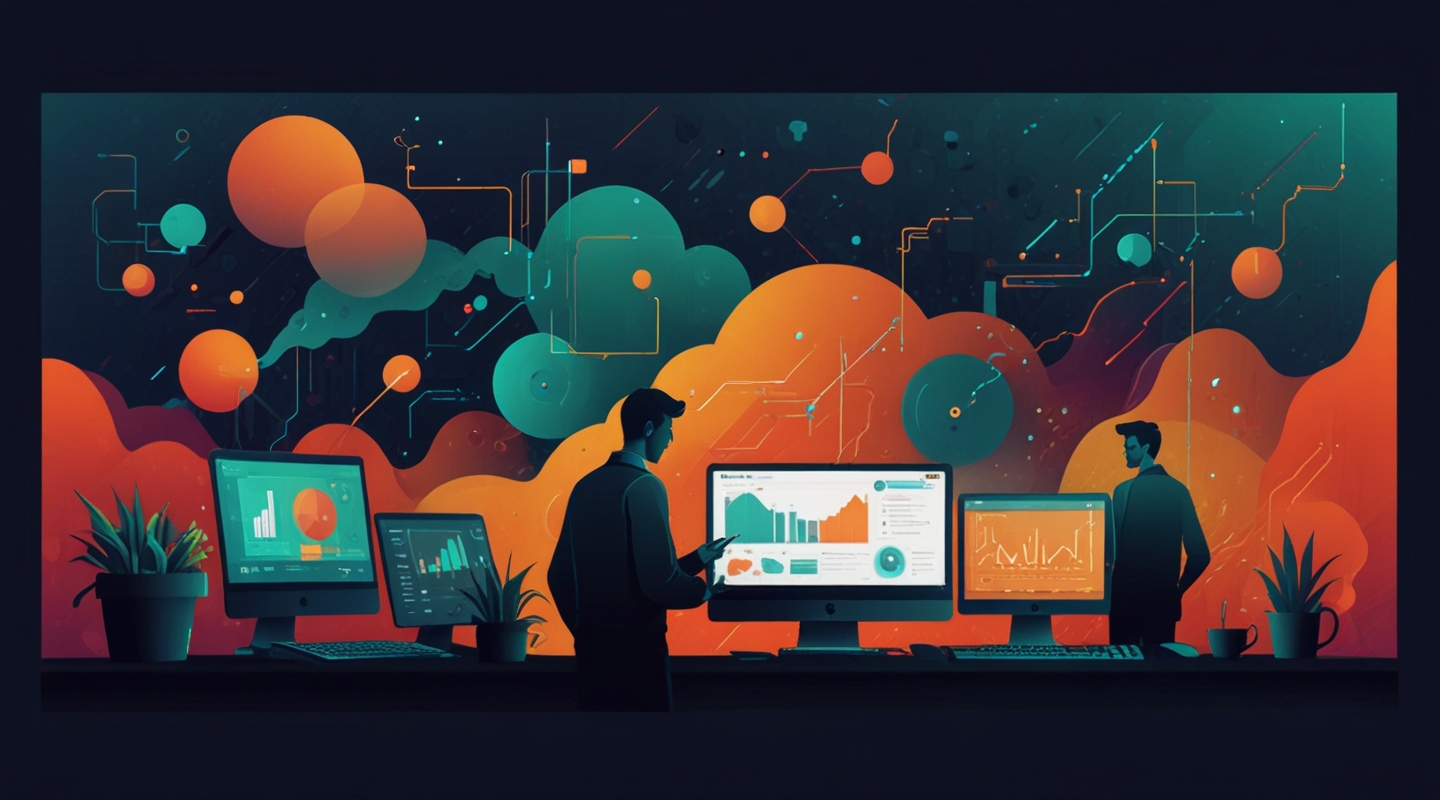
Why 2025 Is a Turning Point for Web Design
Alright, let’s get real for a second. Web design isn’t just about making things look pretty anymore — it’s about crafting experiences that feel alive, intuitive, and genuinely human. I’ve been digging into the shifts brewing for 2025, and honestly, it feels like we’re at one of those rare inflection points where what’s “in” is flipping the script on what’s been “out” for years.
Remember when skeuomorphism was everywhere? Yeah, neither do I — and that’s the point. Trends come and go, but the ones that stick tend to solve real problems or tap into how we actually interact with the web in our daily lives. So, whether you’re a seasoned designer, a developer, or just someone who’s curious about what’s next, let me walk you through what I’m seeing as the major wins and fails for 2025.
What’s In: Bold Minimalism with a Twist
Minimalism has been the darling of web design for a while, but 2025 is about shaking things up with bold minimalism — think fewer elements but with more personality. It’s a bit like wearing a plain t-shirt but pairing it with a wildly expressive jacket that tells a story without saying a word.
One of the biggest shifts? Asymmetrical layouts are making a comeback, but not in a chaotic way. They’re carefully crafted to guide your eye, create tension, and break the monotony without losing clarity. Ever tried designing a homepage that feels balanced but unexpected? It’s tricky but pays off big in user engagement.
Colors are getting louder, too. No more timid pastels or washed-out palettes. Instead, designers are embracing vibrant gradients and saturated hues that pop on both desktop and mobile. It’s a nod to the digital-native generation craving something energetic and fresh.
What’s Out: Overdone Animations and Loader Screens
Now, for the stuff that’s quietly fading into the background. If I had a dollar for every time I saw a website with a spinning loader that felt like a relic from the early 2010s, I’d probably own a small island by now. The truth is, users hate waiting — and these loading animations just remind them they’re waiting.
Similarly, over-the-top scroll-triggered animations are losing their charm. They used to be impressive, but now, they often feel like distractions or even barriers to accessibility. Honestly, if your animations aren’t adding meaning or guiding your visitors, they’re probably doing more harm than good.
Hands-On Example: Rethinking Navigation
Let me share a little story from a recent project — a local startup that wanted a sleek, modern site without the typical “hamburger menu” trap. We went with a sticky, bottom navigation bar inspired by mobile apps, but redesigned it for desktop users as well. The result? Visitors found what they needed 30% faster, and bounce rates dropped noticeably.
The takeaway? Sometimes, borrowing patterns from apps and adapting them thoughtfully to the web can pay off. It’s about respecting users’ habits, not forcing novelty for novelty’s sake.
Tools and Tech: What’s Powering These Trends?
Behind the scenes, frameworks like Next.js and tools like Framer are making it easier to build bold, performant sites without getting bogged down in code bloat. Plus, variable fonts and CSS container queries are finally becoming mainstream, letting designers craft responsive typography and layouts that feel custom-made for every device.
Ever tried variable fonts? They’re a game-changer — imagine a font that smoothly adjusts weight, width, and slant dynamically, reducing the need for multiple font files and speeding up load times. It’s like having a Swiss Army knife for typography.
Accessibility Isn’t Optional Anymore
I can’t stress this enough: accessibility is no longer a nice-to-have or a legal checkbox. It’s baked into the DNA of good design in 2025. Designers are using tools like axe and WebAIM Contrast Checker to ensure color choices meet contrast standards, and implementing semantic HTML to support screen readers.
One of my favorite recent wins was helping a nonprofit rework their donation page with proper ARIA roles and keyboard navigation. The impact? A 25% increase in completed donations. Proof that accessibility isn’t just good ethics — it’s good business.
So… What’s Your Next Move?
Look, trends are just signposts, not rules written in stone. The key is to stay curious, experiment boldly, and always keep the user’s experience front and center. If you’re itching to try something new, maybe start small: swap out your color palette for a bolder gradient, rethink your navigation, or audit your site’s accessibility with tools you trust.
And hey, if you’re stuck or just want to geek out about the latest in web design, drop me a line. I’m always down for a virtual coffee and a chat about what’s coming next.
Give it a try and see what happens.


