Why Web Animations Matter More Than Ever
Hey, I get it. At first, web animations can feel like a flashy add-on—pretty but maybe a bit unnecessary, right? I was skeptical too, honestly. But over years of curating creative showcases and tinkering with animation tools, I’ve come to see them as the secret sauce that turns a flat website into a living, breathing experience. It’s like the difference between a postcard and a short film. Both tell a story, but one pulls you in, makes you linger.
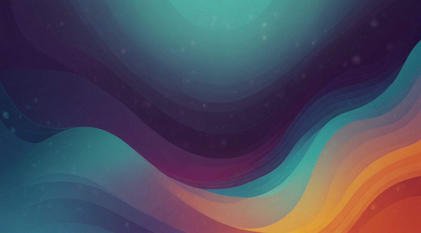
Think about the last time you visited a site that just felt, well, alive. Buttons that gently pulse, images that subtly shift as you scroll, or backgrounds that dance with light. These aren’t just eye candy—they guide your attention, build emotional connection, and even improve usability. The best part? When done right, animations don’t scream for attention—they whisper, coaxing you to explore further.
Getting Real: Examples That Nail It
Let me take you behind the curtain on a few projects that really nailed creative animation without going overboard.
There’s Stripe’s homepage, for example. Ever noticed how their subtle background waves and icon animations flow with your scroll? It’s not just decoration; it creates a rhythm, a pulse that matches your browsing speed and mood. The effect is calming yet engaging, making you feel like you’re part of a high-tech conversation rather than just a visitor.
Or take Awwwards’ showcase—a treasure trove of innovative web animation. Some sites there use micro-interactions that react instantly to your cursor, creating a tactile sense of touch. Others use full-screen transitions that feel cinematic, turning navigation into an experience rather than a chore.
One project stuck with me—a portfolio site where the profile image subtly morphs based on the time of day. Morning, it’s bright and fresh; evening, soft and warm. It’s a small touch but it feels deeply personal, like the site breathes with you, not just for you.
Practical Tips for Bringing Your Site to Life
Alright, enough inspiration—how do you actually get started? Here’s the lowdown, from someone who’s wrestled with buggy animations and performance headaches more times than I care to admit.
- Start Small and Purposeful. Resist the urge to animate everything. Pick key moments that benefit from movement—like a call-to-action button gently pulsing, or a hover effect that gives feedback. Animation should support usability, not distract.
- Use CSS for Micro-Interactions. For simple fades, slides, and hover effects, CSS animations are lightweight and easy to maintain. Plus, they play nicely with accessibility tools.
- Bring in JavaScript When You Need Power. Libraries like GSAP or Anime.js give you granular control for complex sequences or scroll-triggered animations. Just be sure to keep an eye on performance.
- Optimize for Performance. Animations can tank load times if you’re not careful. Use hardware-accelerated CSS properties like transform and opacity to keep things smooth. Test on mobile devices early and often.
- Respect Accessibility. Always provide a way to reduce or disable animations for users who prefer it. Remember, not everyone experiences motion the same way.
Story Time: When Animation Saved the Day
Once, I worked on a website redesign for a small non-profit. They had a complicated donation form that users kept abandoning halfway through. We decided to add subtle animations to the form fields—highlighting errors with gentle shakes, and celebrating success with a quick confetti burst on submission.
The results? Conversion rates jumped by nearly 20%. It sounds small, but that tiny animation made the process feel less intimidating and more human. People responded to the feedback, felt reassured, and stuck around. It was a humbling reminder that animation isn’t just pretty—it’s persuasive.
What About Overdoing It? The Fine Line
Look, I’ve seen sites that throw every animation trick in the book at you: flashing text, bouncing buttons, spinning logos. Spoiler alert: it doesn’t work. Overuse kills the magic and can even drive people away.
So how do you avoid that? Keep your animations consistent with your brand’s voice and purpose. Use them to tell a story or guide attention—not just to show off. And always ask yourself: does this add value or just noise?
Ready to Animate? Here’s Your Quick Starter
If you’re itching to dip your toes in, here’s a simple starter project you can try right now:
<!-- Animate a button with a gentle pulse on hover --><style> .pulse-button { background-color: #5a9; border: none; padding: 1rem 2rem; color: white; font-size: 1.2rem; border-radius: 8px; transition: transform 0.3s ease-in-out; } .pulse-button:hover { animation: pulse 1.5s infinite; } @keyframes pulse { 0% { transform: scale(1); box-shadow: 0 0 0 rgba(90, 153, 90, 0.7); } 50% { transform: scale(1.05); box-shadow: 0 0 10px rgba(90, 153, 90, 0.4); } 100% { transform: scale(1); box-shadow: 0 0 0 rgba(90, 153, 90, 0.7); } }</style><button class="pulse-button">Donate Now</button>Try it, tweak the colors or duration, and see how a little movement can bring a button to life. Seriously, it’s addictive.
Wrapping Up (For Real This Time)
So, what’s the takeaway here? Creative web animations aren’t just about flexing your design muscles—they’re about creating an emotional bridge between your site and its visitors. When done thoughtfully, they guide, delight, and communicate in ways static images simply can’t.
Next time you’re building or refreshing a site, think about the moments that could benefit from a little motion. Start small, keep it purposeful, and don’t be afraid to experiment. And hey—if you hit a snag or want to geek out about animation tools, you know where to find me.
So… what’s your next move?


