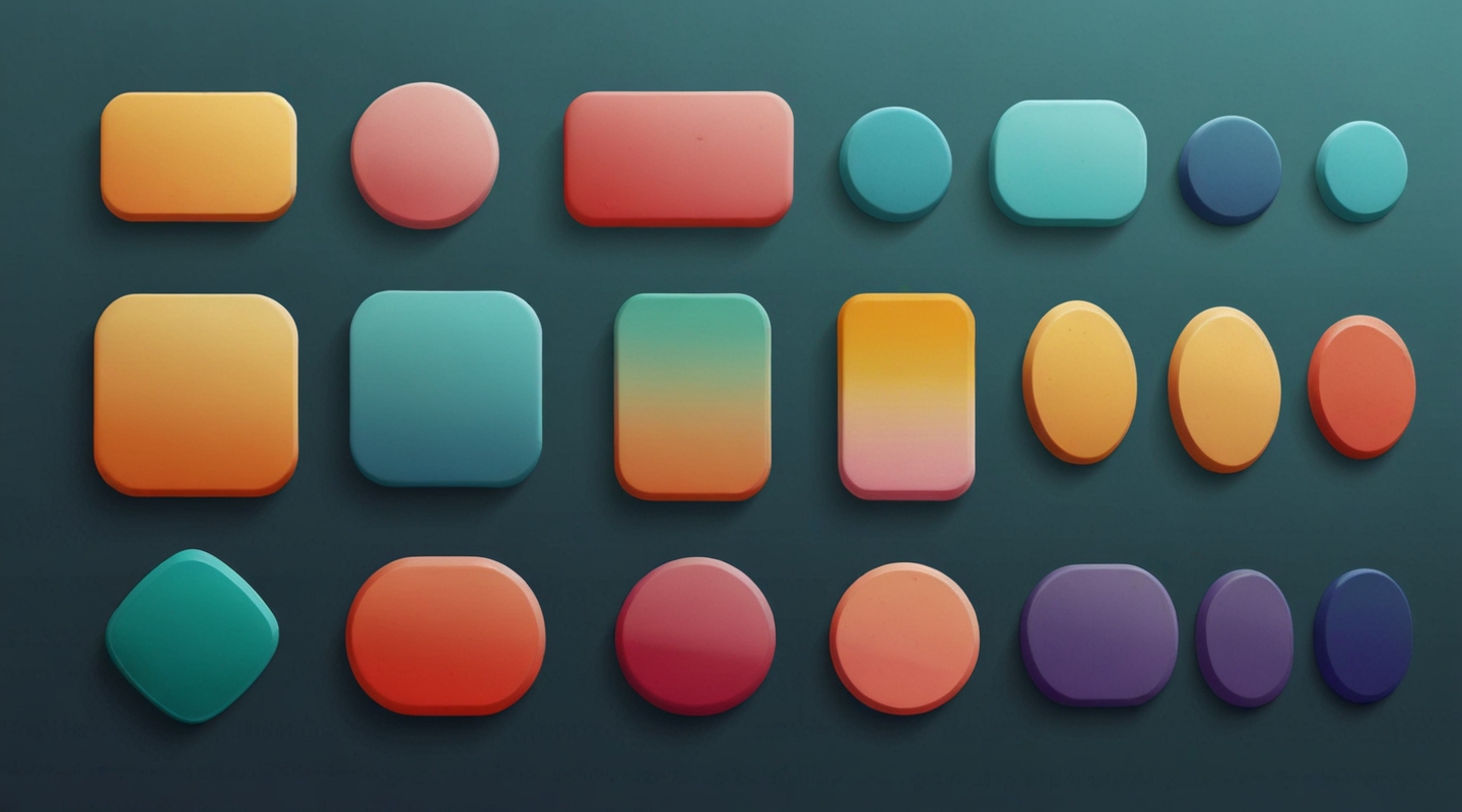
Why Responsive Buttons Matter More Than You Think
Alright, let’s kick this off by getting real about buttons. They’re everywhere, right? From the big red “Buy Now” on your favorite shopping site to the subtle “Submit” on a contact form. But here’s the kicker — if your buttons don’t respond well across devices, you’re basically handing users a clunky experience on a silver platter. I’ve seen it too many times: a button that looks great on desktop but turns into a nightmare on mobile. And honestly? That’s a missed opportunity to engage, convert, or just make someone’s day smoother.
Responsive buttons aren’t just about resizing. It’s about feeling right under your finger or mouse pointer, giving clear feedback, and adapting elegantly to every screen size. If you nail this, you’ll notice your interfaces start to feel alive — like they’re actually listening to your users.
Getting Your Hands Dirty: The Basics of Responsive Button Styling
Now, before you dive into dozens of frameworks or libraries, let me tell you a little secret: you can build fully responsive, slick buttons with pure CSS. No magic, no heavy JavaScript needed. Just solid CSS fundamentals and some thoughtful tweaks.
Here’s a quick rundown of the essentials I always start with:
- Flexible sizing: Avoid fixed pixel widths. Instead, lean on
em,rem, or percentages so buttons scale naturally with text size and parent containers. - Padding and touch targets: Fingers are clumsy. Make sure your buttons have generous padding — at least 44×44 pixels is the recommended minimum for touch accessibility.
- Hover and focus states: Feedback is king. Use color shifts, shadows, or subtle animations to signal interactivity.
- Rounded corners and shadows: These add a modern touch and improve visual hierarchy without overwhelming the design.
Here’s a simple example you can play around with:
.btn {
  display: inline-block;
  padding: 1rem 2rem;
  font-size: 1rem;
  border-radius: 0.5rem;
  background-color: #007BFF;
  color: white;
  border: none;
  cursor: pointer;
  transition: background-color 0.3s ease, box-shadow 0.2s ease;
}

.btn:hover, .btn:focus {
  background-color: #0056b3;
  box-shadow: 0 4px 8px rgba(0, 0, 0, 0.2);
  outline: none;
}

@media (max-width: 600px) {
  .btn {
    width: 100%;
    padding: 1.5rem 0;
    font-size: 1.25rem;
  }
}
This snippet covers the basics: scaling font size and padding for smaller screens, a clean hover effect, and a comfortable touch target on mobile. But, of course, things get more interesting when you layer in real-world constraints.
Real Talk: What Makes a Button Truly Responsive?
I want you to imagine this — you’re on a crowded train, eyes half-lidded, trying to book tickets on your phone. The “Confirm” button is tiny, nestled in a corner. You miss it twice, your finger pressing nearby text instead. Frustrated? Me too. That’s the moment when responsive design stops being a buzzword and becomes a lifeline.
So beyond resizing, here’s what really counts:
- Context-aware sizing: Buttons should grow or shrink depending on the screen real estate but also the content around them. Think about your layout flow — inline buttons on desktop might stack on mobile.
- Adaptive typography: Text inside buttons needs to remain legible and balanced as the button changes size. Using relative units like
emorremhelps keep things consistent. - Touch-friendly spacing: On mobile, spacing between buttons is crucial to avoid accidental taps. Don’t cram your buttons side by side without breathing room.
- Visual feedback on all devices: Hover effects vanish on touch — so focus states and active states become your best friends. Also, consider adding subtle scale animations on tap for tactile feeling.
Step-by-Step: Building a Responsive Button from Scratch
Okay, enough talking — let’s build. Picture a signup form with a big, inviting “Get Started” button. Here’s the journey I usually take with a client or side project:
Step 1: The HTML foundation
Simple, semantic, and clean. A button element with a class for styling.
<button class="btn">Get Started</button>Step 2: Basic styling
Start with colors, padding, and basic border radius.
.btn {
  background-color: #28a745; /* fresh green */
  color: white;
  padding: 0.75rem 1.5rem;
  font-size: 1rem;
  border: none;
  border-radius: 0.375rem;
  cursor: pointer;
  transition: background-color 0.3s ease;
}
Step 3: Add hover and focus states
Don’t ignore keyboard users or those who rely on focus outlines. I like to customize focus to something subtle but clear.
.btn:hover {
  background-color: #218838;
}

.btn:focus {
  outline: 3px solid #80e27e;
  outline-offset: 3px;
}
Step 4: Make it responsive
This is where most folks stop, but we want to go further. Adjust padding and font size on smaller screens, and make the button full width so it’s easier to tap.
@media (max-width: 480px) {
  .btn {
    width: 100%;
    padding: 1rem;
    font-size: 1.125rem;
  }
}
Step 5: Add subtle interaction feedback
Try a tiny scale transform on active (when the button is pressed). Makes it feel like the button is alive.
.btn:active {
  transform: scale(0.98);
  transition: transform 0.1s ease;
}
Bonus: Accessibility and Performance Tips
Look, it’s tempting to go wild with shadows, gradients, or even animations. But here’s what I’ve learned: simplicity wins. Keep your buttons accessible and fast-loading. Here are a few quick tips:
- Use semantic elements: Prefer <button> over <div> or <span>. Screen readers love it.
- Don’t rely solely on color: Use contrast, borders, or icons to indicate states for colorblind users.
- Keep hover states subtle: Overdoing it can hurt performance and annoy users.
- Test on real devices: Emulators are great, but nothing beats feeling your button in the wild.
Wrapping It Up (But Not Really)
I hope this feels less like a lecture and more like that chat we’d have over coffee — the kind where you might pause, nod, or even argue a bit. Responsive buttons seem small, but they’re a core piece of your UI’s personality and usability. They’re like the handshake of your site: firm, welcoming, and unmistakably human.
So… what’s your next move? Tweak those buttons, run some tests, or maybe break a few rules and see what sticks. And hey, if you come up with killer button styles or neat little tricks, I’m all ears.






