Why Multimodal UX Design Matters More Than Ever
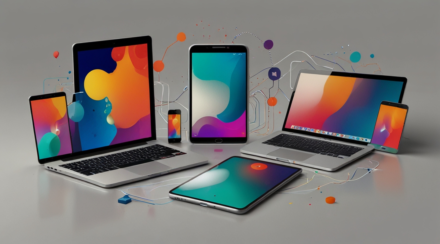
Picture this: you start your morning checking messages on your phone, then switch to your tablet to browse a recipe, and finally sit down at your laptop to write a report. Sounds familiar, right? The way we bounce between devices these days isn’t just a quirk of modern life—it’s a fundamental shift in how people interact with technology. That’s where multimodal UX design steps in, and honestly, it’s a game changer.
Multimodal UX isn’t just about making apps look good on different screens. It’s about creating experiences that feel natural and continuous no matter where or how you engage. Think voice commands blending with touch, gestures syncing with visual cues, or even haptic feedback that complements what you see. It’s designing for a user who’s not glued to a single device but navigating a whole ecosystem.
At first, I wasn’t totally sold on the hype around multimodal interfaces. You know, I thought it was just another buzzword tossed around at conferences. But then I started experimenting—really digging into how users shift context between devices. Spoiler: it’s messy if you don’t plan for it.
Breaking Down the Multimodal UX Experience
Imagine you’re designing a fitness app. Someone starts a workout on their smartwatch, glances at stats on their phone mid-run, then reviews full session details on their tablet later. Multimodal UX design means ensuring all these touchpoints talk to each other smoothly. No lost data, no awkward interruptions.
Here’s the kicker: it’s not just about UI responsiveness or device compatibility. It’s about modalities—the different ways users interact with your product. Voice, touch, type, gesture, even gaze. Each mode carries its own rhythm, its own strengths and quirks.
From my experience, the biggest mistake? Treating each device or input mode as a silo. Like, “Oh, here’s the phone version, here’s the desktop version, and the voice commands are an afterthought.” Nope. Instead, design with the whole experience in mind. How does a tap on a phone translate to a voice prompt on a smart speaker? How does a pinch gesture on a tablet feel when the same feature is voice-controlled on a TV?
Practical Tips for Implementing Multimodal UX
Okay, let’s get hands-on. If you’re itching to try multimodal UX design without feeling overwhelmed, start here:
- Map Your User Journey Across Devices: Get a whiteboard or, better yet, a digital tool like Miro, and chart out where your users interact with your product. Where do they start? Where do they switch? This map is your north star.
- Prioritize Contextual Continuity: Users hate feeling like they’re starting over. Use synced states and cloud saves so progress persists effortlessly. Think about how Spotify pauses a song on your phone and picks up on your laptop without missing a beat.
- Design for Input Flexibility: Don’t force users into one mode. Include voice commands, keyboard shortcuts, touch gestures—whatever fits. But also ensure fallback options exist in case a device doesn’t support a modality.
- Test in Real-Life Scenarios: You know those lab tests? Forget them for a sec. Watch people actually use your product in transit, at their desk, or on the couch. Notice how their hands fumble switching devices or how their environment affects interaction.
- Leverage Existing Multimodal Frameworks: Google’s Material Design, Apple’s Human Interface Guidelines, or Microsoft’s Fluent Design provide solid foundations. They’re not gospel, but they offer practical patterns and components you can adapt.
Fun side note: I once worked on a project where we added voice control to a financial dashboard. It was wild how users suddenly felt more empowered—especially folks multitasking or with accessibility needs. Multimodal design isn’t just a tech trend; it’s a way to democratize access.
Common Challenges and How to Tackle Them
Not going to sugarcoat it, multimodal UX design can be tricky. Here are a few snags I’ve run into—and how I learned to handle them:
- Inconsistent Experience: Different devices have different capabilities. The trick is to design for the lowest common denominator but enhance where possible. Progressive enhancement, anyone?
- Latency and Sync Issues: Nothing kills the vibe like delayed data syncing. Use real-time databases like Firebase or implement smart caching strategies to keep things smooth.
- Overloading Users: Sometimes multimodal means too many options. I’ve seen users get overwhelmed by voice commands layered on top of touch controls. Keep it simple. Prioritize the most natural modes for your audience.
- Accessibility Concerns: Multimodal should enhance accessibility, but if done poorly, it can confuse screen readers or assistive tech. Always test with actual users who rely on these tools.
Real-World Example: A Day in the Life of Multimodal UX
Let me walk you through a real case that sticks with me. I was part of a team redesigning a smart home app that works across phone, voice assistants, and wearables. The client wanted a frictionless way for users to control lighting and temperature without toggling endlessly between devices.
We prototyped a setup where you could start adjusting the thermostat on your phone, then pause and finish via voice command while cooking. The app remembered where you left off and even offered subtle haptic feedback on the watch when the temperature changed. Testing it with users, the aha moment was palpable. They felt like the app was reading their minds—helping without interrupting.
This taught me that the magic lies in anticipating user intent and building bridges—not walls—between modes.
Tools & Resources to Dive Deeper
If you’re curious (and you should be), here are some tools and reads that helped me wrap my head around multimodal UX:
- Google Material Design – great for foundational design principles and multimodal components.
- Apple Human Interface Guidelines – super detailed on voice, touch, and cross-device design.
- Firebase – perfect for syncing data in real-time across devices.
- UX Collective’s Multimodal Interfaces Primer – a thoughtful read for context and strategy.
Wrapping It Up — What’s Next?
Implementing multimodal UX design isn’t about chasing the latest shiny tech gadget. It’s about respecting how people actually live their digital lives—messy, flexible, multi-tasking, sometimes distracted, but always moving across devices.
If you’re itching to dive in, start small. Experiment with one new input mode or smooth state sync between two devices. Watch how people react and iterate. Trust me, the payoff is worth the effort.
So… what’s your next move? Ever tried weaving multimodal design into your projects? If not, grab a coffee, sketch a user journey, and see where it takes you. You might just unlock that seamless cross-device magic we all crave.


