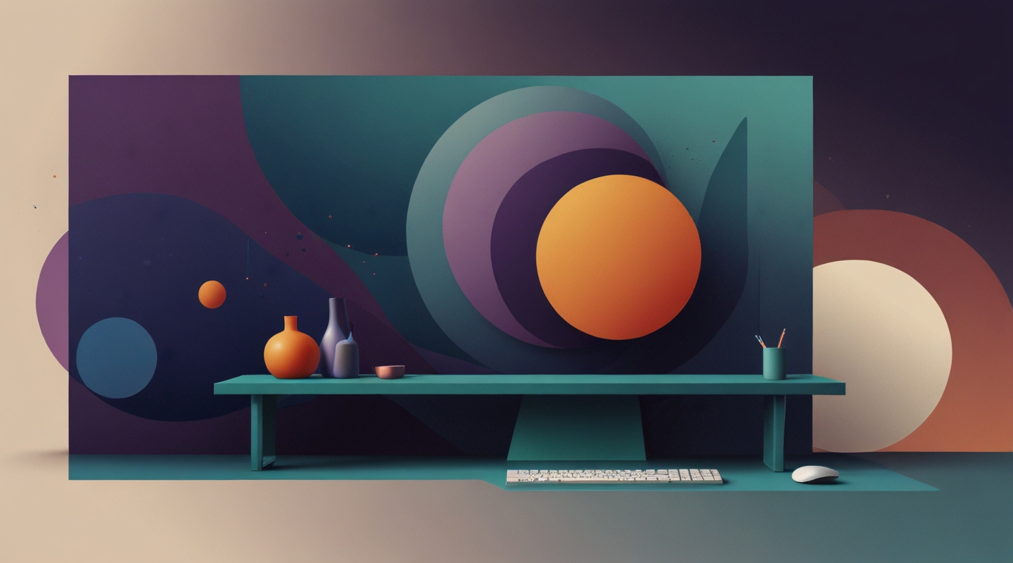
Why Minimalism Isn’t Just a Trend—It’s a Focus Strategy
Hey, let’s get real for a minute. Minimalism in web design sometimes gets tossed around like it’s just about making things look “clean” or “pretty.” But from where I’m sitting, it’s way more than that. It’s a strategic choice to strip away the noise and let users zero in on what really matters. Think of it like tuning a radio: you want to cut out the static and hear the music clearly, right?
Years ago, I was knee-deep in projects where clients wanted every bell and whistle crammed onto a single page. Buttons, animations, banners, you name it. The result? Users bounced faster than a rubber ball on concrete. The lesson? When you cram too much in, the brain just throws up a wall and tunes out. Minimalism isn’t about doing less for the sake of it; it’s doing less to give more space for focus.
What Makes a Minimalist Website Design Truly Inspirational?
Let’s break it down. A minimalist site that nails user focus usually ticks these boxes:
- Intentional whitespace: It’s not just empty space; it’s breathing room. Like a quiet pause in a conversation that makes what’s said next hit harder.
- Limited color palette: Using just a few colors, often muted or complementary, so your eye isn’t darting around like it’s on a sugar high.
- Clear typography hierarchy: Fonts aren’t just chosen for style but for guiding the reader’s journey—big headlines, punchy subheads, and readable body text.
- Purposeful imagery: Images aren’t filler; they support the message without overwhelming or distracting.
- Simple navigation: No maze-like menus or dropdowns that make you feel like Indiana Jones. Just clear paths to where you want to go.
Here’s the kicker—when these elements come together, the site doesn’t just look minimalist; it feels intentional. And that feeling? It’s magnetic.
Walking Through a Real-World Example
Take Apple’s homepage. Sure, it’s a giant brand, but the design principles are gold for anyone. Notice how the white space frames the product shot? The headline is bold but not screaming. The call-to-action buttons are obvious but don’t shout. Your eye is gently guided down the page, not shoved or pulled in conflicting directions.
I remember dissecting their layout during one project and thinking, “Why does this feel so effortless?” It’s because every pixel has a job. No distractions, no extras. Just pure, focused storytelling through design.
How to Build Your Own Minimalist Website That Commands Attention
So you want to give your site that laser-focused vibe? Here’s a no-BS approach that I swear by—think of it as a recipe you can tweak:
- Start with your content: What’s the absolute core message? Write it out. Cut everything else. If it doesn’t serve that core, it’s a no-go.
- Choose a restrained color scheme: Limit yourself to 2-3 main colors. Use tools like Coolors to find palettes that feel intentional and balanced.
- Prioritize typography: Pick a font pairing that’s readable and with good contrast. Use size and weight to create a clear hierarchy. Google Fonts has tons that are free and reliable.
- Whitespace is your friend: Don’t rush to fill every inch. Let the content breathe. It helps the eye rest and focus.
- Simplify navigation: Keep menus short and logical. If you have tons of pages, consider a well-organized footer instead of a cluttered header.
- Use imagery sparingly: When you add images, make sure they complement, not compete. Think of them as accents, not the main event.
- Test and iterate: Watch how users interact. Tools like Hotjar or Google Analytics can tell you if people are lost or distracted.
Honestly, the biggest hurdle is resisting the urge to add more “cool” features that don’t actually add value. I’ve been there, too. You see a fancy slider or a parallax effect and think, “This will wow them!” But often, it just muddies the water.
Tools and Resources That Make Minimalist Design Easier
If you’re wondering where to start, here are a few gems I lean on:
- Figma for clean, collaborative design work that lets you experiment with layouts without getting lost.
- Minimalist landing page templates — a shortcut to see how pros structure their pages.
- Smashing Magazine’s take on minimalist UX — a thoughtful dive into why less is more for user experience.
Common Misconceptions About Minimalism
Before I wrap, a couple of myths worth busting:
- Minimalism is boring: Nope. It’s about depth, not decoration. A minimalist site can be stunningly bold or quietly powerful.
- Minimalism means fewer features: Not necessarily. It means fewer distractions. The right features, well-placed, can shine in simplicity.
- Minimalism is easy: Ha, if only. Stripping down takes discipline. It’s about knowing what to keep and what to toss, which is harder than it sounds.
Wrapping It Up (But Not Too Neatly)
Honestly, minimalism in web design is like a secret handshake among designers who get it. It’s about respect—respect for the user’s time, attention, and experience. It’s about making a site that doesn’t just look good but feels right.
So next time you’re tempted to pile on another flashy widget or cram in extra info, pause. Ask yourself: “Is this helping someone focus or pulling their attention away?”
Give minimalist design a real shot — not just as a style choice but as a purpose-driven strategy. You might be surprised how much clarity you can create just by knowing what not to do.
So… what’s your next move? Ready to clear the clutter and build a site that’s a breath of fresh air?






